Automating complex marketing campaigns is the key value of Act-On but most users found it exceedingly difficult to use. It was costing the company customers and new deals.
Product Designer
2020
4 months
Product Manager
Develoment Team
Stakeholder interviews
Competitive analysis
Workshop
Mockups
Prototypes
Executive presentations
Final specs
Asset production
The way the existing tool was laid out was highly confusing for most users. Most marketing teams used external flowchart software (or even pen and paper) to build the logic of the automation before tediously inputting back into Act-On.
Once complete, if was hard to verify if it was free of errors. A lot of users expressed intimidation at using the feature, for fear they would unwittingly program an error that would not be caught before launch.
The original automation builder provided a lot of functional value but was not intuitive or user friendly.
We started by sketching out builder ideas that matched how marketers mapped out their campaign journeys.
Nailing down the right visual hierarchy and color system.
We then built a simple prototype to get some early feedback on the concept.
Screenshot of the simple prototype we used for validation.
I explored a wide range of visual styles to find the right combination to communicate the overall structure and individual steps, while also fitting in with our product style and brand.
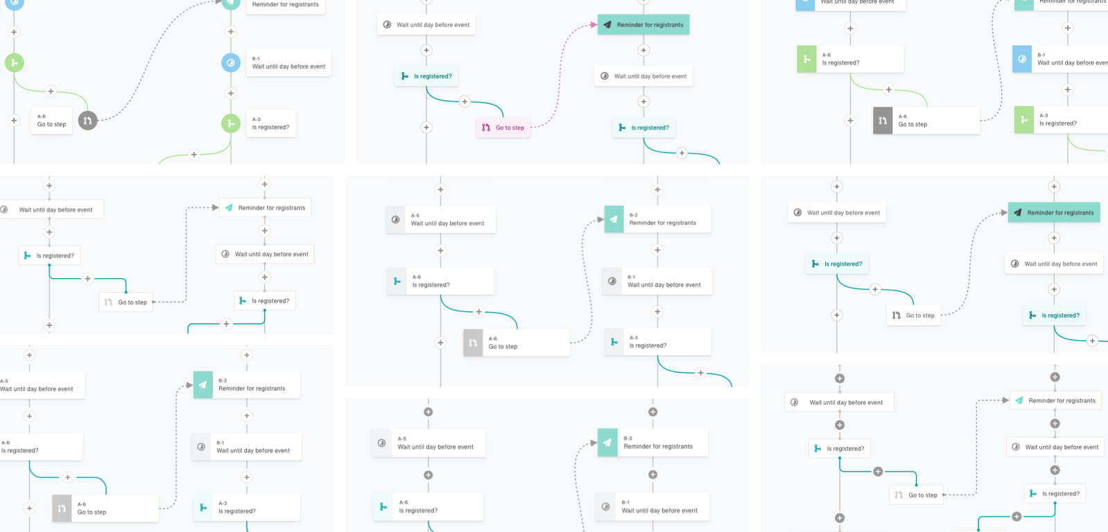
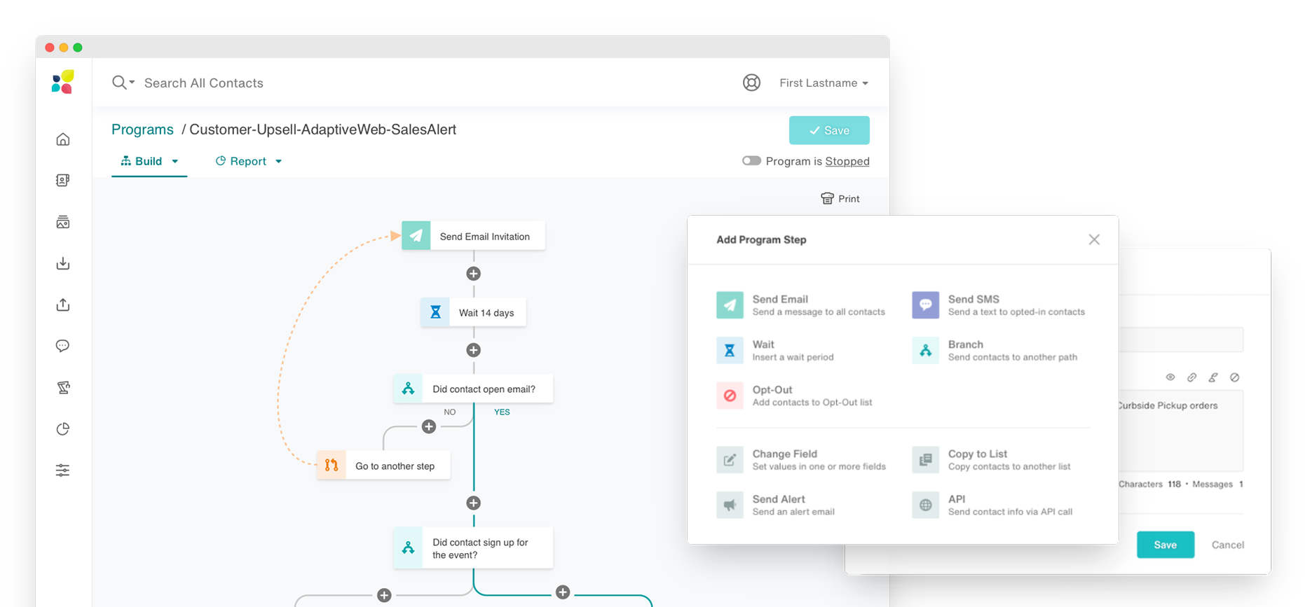
Early exploration of a flow-chart style builder.
To best evaluate the effectiveness of the design, we presented customers with their automations mocked up in the new design. This allowed us to track how easy it was to find information and answer questions within a familiar framework.
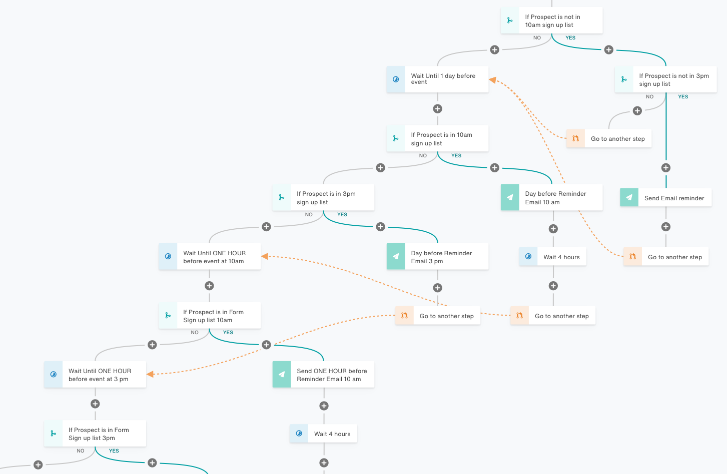
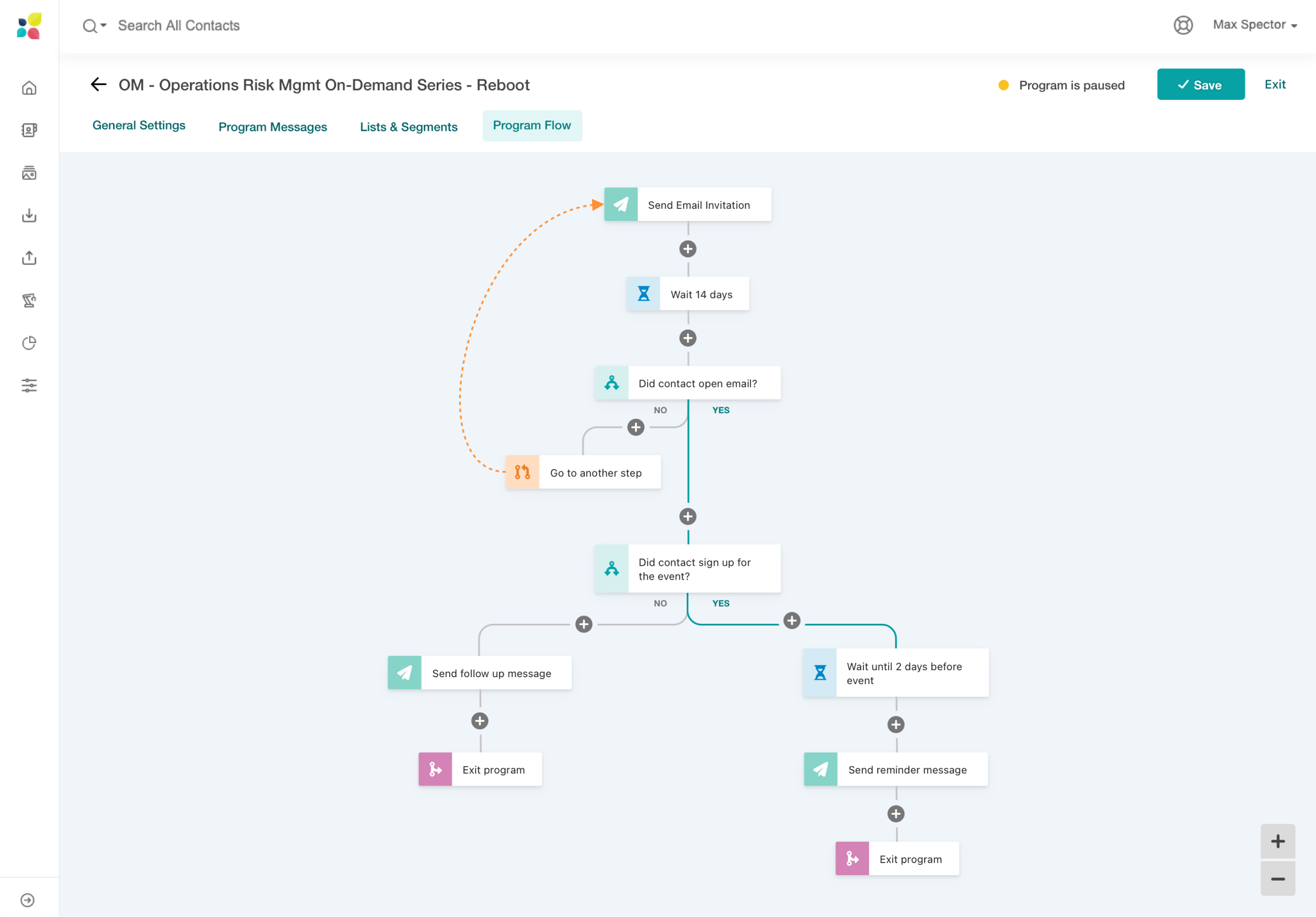
A customer automation that I mocked up to test clarity and ease of navigation.
With our solution validated, it was time to craft what would be delivered. I worked closely with our engineering and product team to ensure every detail was on point.
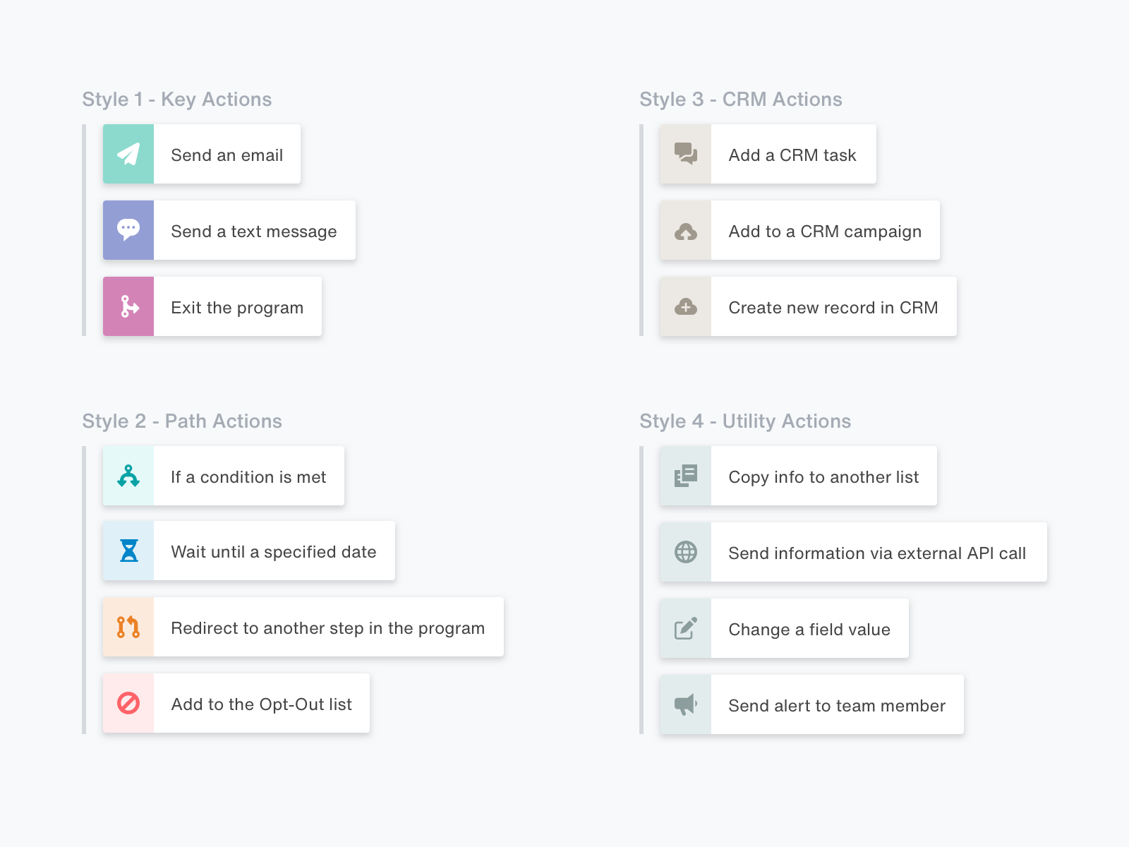
Grouping the different steps and differentiating with style.
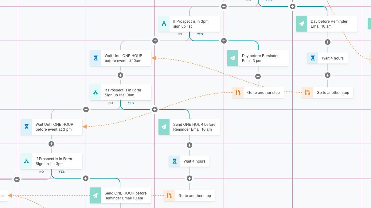
Plotting out how the builder would be positioned on the canvas grid.
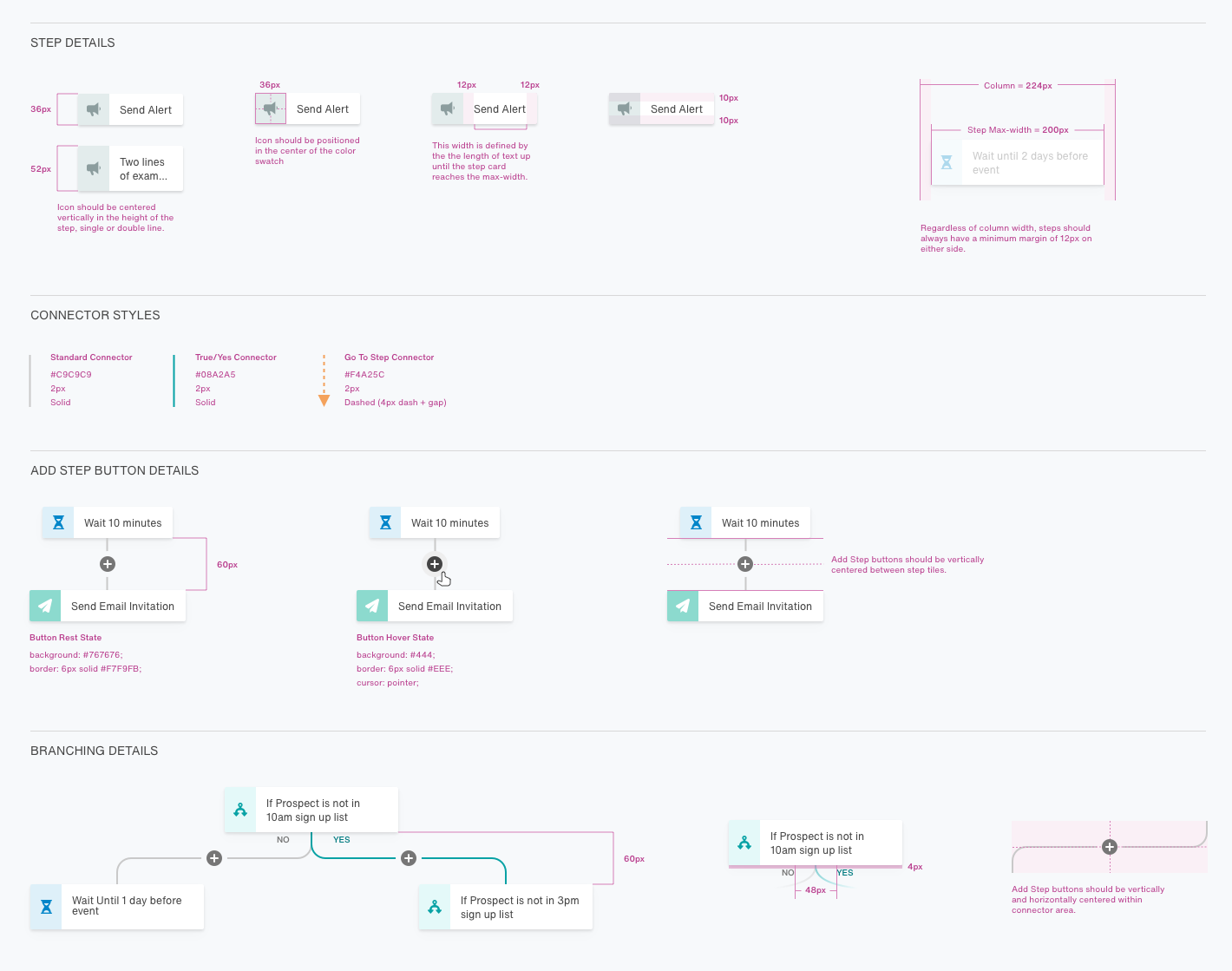
Documenting those little details that add up to an elevated user experience.
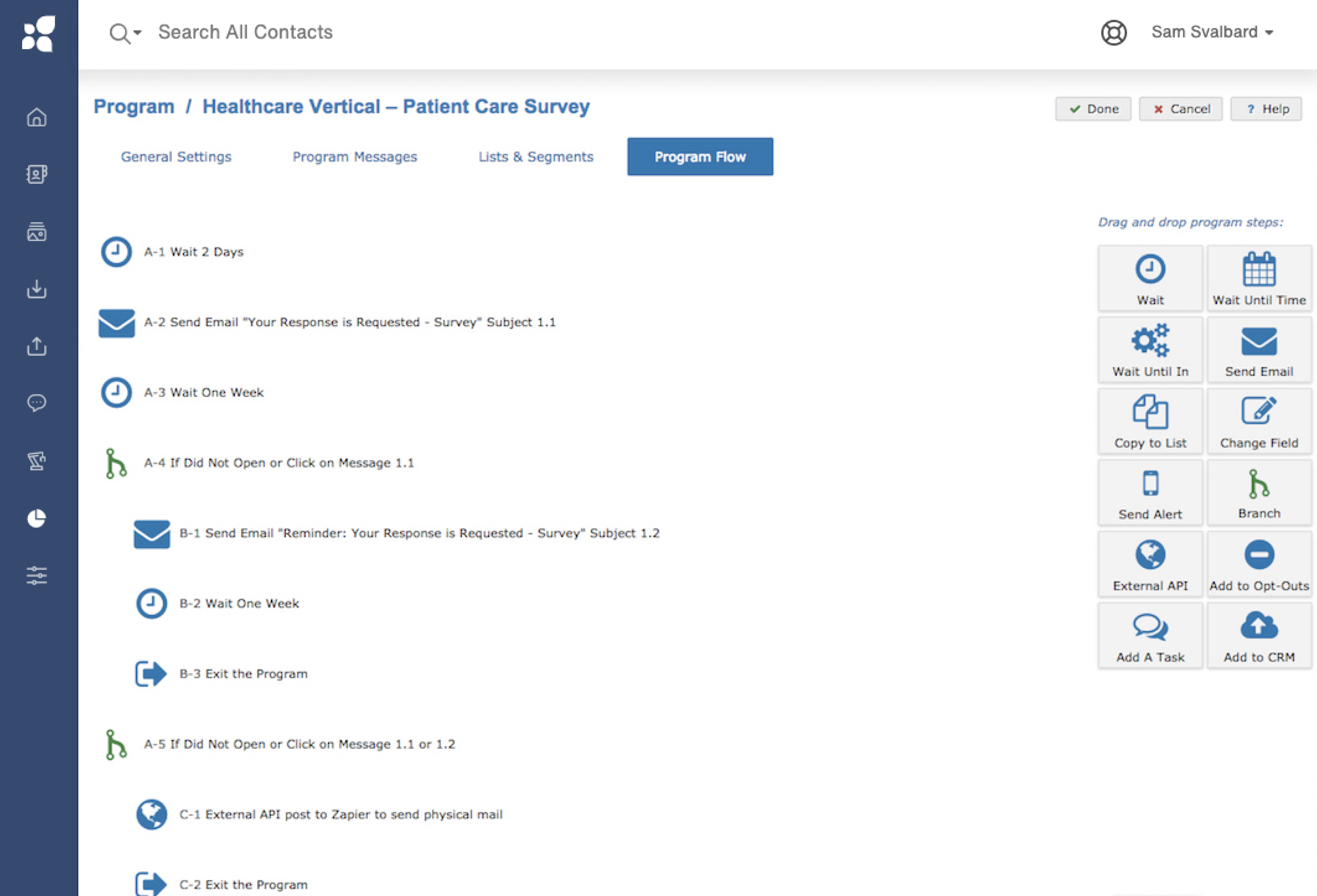
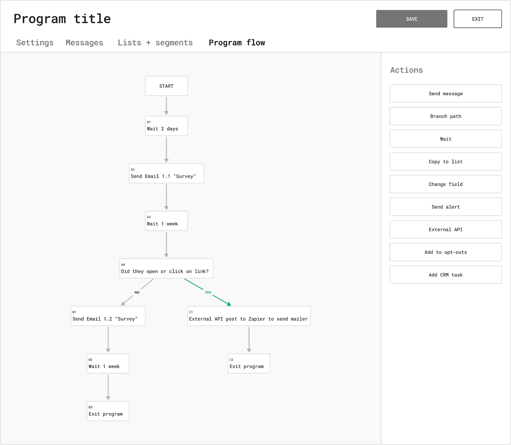
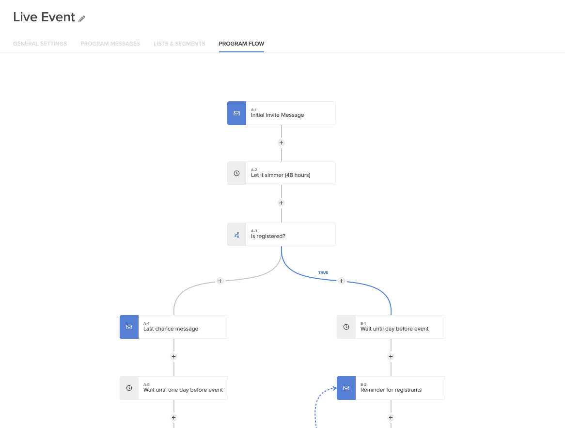
The end result was a complete redesign of the feature including the settings pages and step details.
The first release of the builder was greeted with massive enthusiasm.
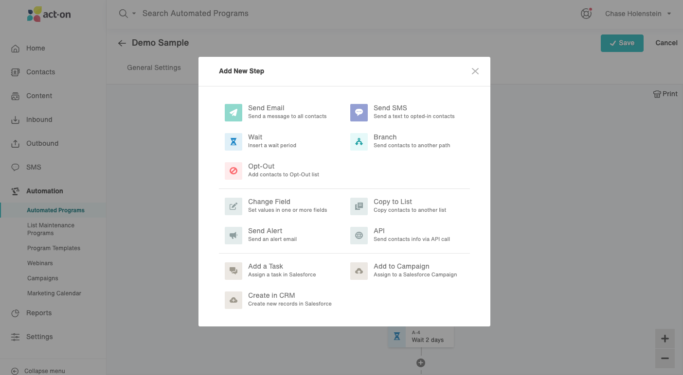
The updated step menu differentiated and clarified the set of options.
It had a pretty big impact from a sales standpoint, boosting our revenue by 29% after release.
It also played a large role in helping lock down $20M in venture funds, which led to expansion of the product and design team.
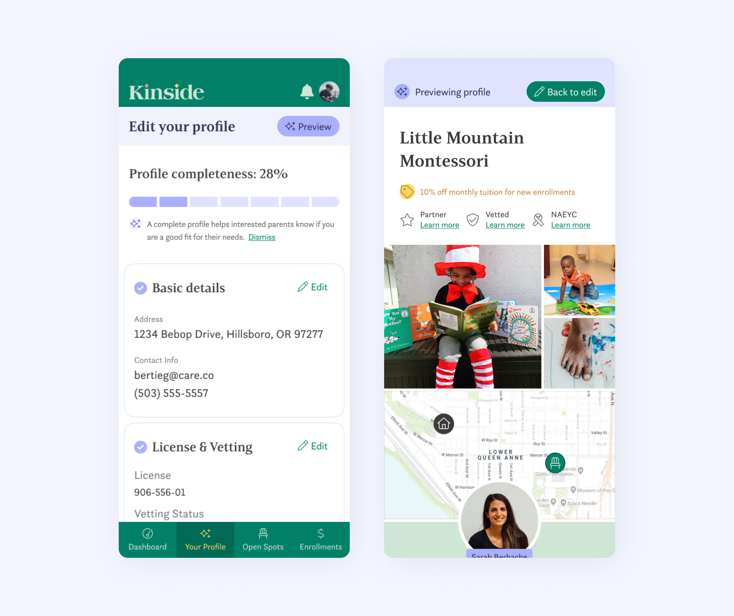
Updated provider profiles are key to Kinside but there was a low completion rate.